Thank you to the many people who have e-mailed me recently and asked if I have been silenced. I have not. I have had letters from Public Health England and the General Medical Council, informing me that I was under investigation for daring to question anything about COVID19, particularly vaccines.
The good news is the investigations ended up nowhere, and were closed down. I have also had irate phone calls from doctors, telling me that I must not question vaccination and suchlike. This has been somewhat wearing and has caused me to remain silent for a while and think about things.
However, I do know how to play the medical regulations game. Don’t make a statement you cannot reference from a peer-reviewed journal. Don’t give direct advice to people over the internet. Provide facts, and do not make statements such as ‘vaccines are killing thousands of people.’ Or suchlike.
Not that I ever would. My self-appointed role within the COVID19 mayhem, was to search for the truth – as far as it could be found – and to attempt to provide useful information for those who wish to read my blog.
The main reason for prolonged silence, and introspection, is that I am not sure I can find the truth. I do not know if it can be found anymore. Today I am unsure what represents a fact, and what has simply been made up. A sad and scary state of affairs.
This is not just true of the mainstream and the mainstream media, which has simply decided to parrot all Government and WHO statements without any critical engagement…or thought. For example, the BBC intones that ‘In the last day, fifty people died within twenty-eight days of a positive COVID19 test…’ Or a hundred, or six. What the hell is this supposed to mean? It means nothing, it is the very definition of scientific meaninglessness.
Especially when it seems that very nearly a half of those admitted to hospital with COVID19 were not admitted to hospital with COVID19. They were admitted with something else entirely, then had a positive test whilst in hospital. In short, they were not admitted to hospital with COVID19, and almost certainly did not die of COVID19. They died with a positive COVID19 test. With, not of.
But the misinformation is equally a problem for those on the other side. Claims are made for the benefits of Ivermectin and hydroxychloroquine that simply do not stand up to scrutiny. Yes, I believe both drugs may provide some benefit, but not the claimed 90% reduction in deaths that I have seen trumpeted.
So, I have given up on COVID19. It is a complete mess, and I feel that, without being certain of the ground under my feet, I have nothing to contribute. I too am in danger of starting to make statements that are not true.
However, before leaving the area entirely, I would like to make clear some of the things I currently believe to be true, and what I do not believe to be true. If this is of any assistance to anyone. Very little is referenced, because I can very easily find a contradictory reference to any reference I provide. For each fact, there is an equal and opposite fact.
1: SARS-CoV2 exists
Many people have stated, probably correctly, that the SARS-CoV2 virus has never been fully isolated. Whatever exactly that means. Have Koch’s postulates been met? [see a bit later on] I think for viruses, Koch’s postulates are very rarely, if ever, met. Does it matter, not really.
Despite this gap I believe that SARS-CoV2 truly is a ‘new’ virus that did not exist before. So, it must have mutated somewhere, or been mutated somewhere, from another coronavirus… probably. Although it seems that SARS-CoV2 does not mutate. Instead, it creates variants which, somehow or other, is a completely different process to a mutation! I have found that language in this area means little, and words are simply twisted to suit a particular narrative.
I feel it is most likely this mutation occurred within a laboratory in Wuhan during gain of function research. But I don’t suppose we will ever know. It seems unlikely to be something that the Chinese authorities are ever going to admit… ever. As a general rule, the more fervently, and angrily, the Chinese state denies something – the more likely it is to be true.
This is a special case of a general rule that I modestly call the ‘Kendrick reverse meaning law.’ Which developed from P.G. Wodehouse’s observation that ‘When an Englishman says ‘trust me’ it is time to start counting the spoons.’
This reverse meaning was seen clearly when Matt Hancock (UK Health Secretary at the time) stated that ‘Right from the start we’ve tried to throw a ring of steel around our care homes.’ Which actually meant that ‘Right from the start we threw care homes under a bus.’ Unless, what he actually meant was that the ring of steel was put up to stop care home residents escaping. ‘Halt, who goes there….’ Sound of heavy machine gun fire, whistles screeching, attack dogs baying at the leash. ‘Go for the Zimmer frames, that should bring them down.’
2: SARS-CoV2 is generally more deadly than influenza
Of course, SARS-CoV2 is most certainly not deadlier than the influenza epidemic of 1918-19. Which is estimated to have wiped out 2% of the entire world’s population. It is probably not more deadly than the 1957 epidemic, or the 1967 influenza epidemic. But it seems more deadly than anything in the last forty years, or so. So, a bit more deadly than most influenzas that sweep through humanity every year, or so. Give or take.
Currently, SARS-CoV2 is reckoned to have killed four and half million people across the Globe. Which is 0.07% of the world’s population. However, there is an immediate problem here. With influenza, we count for one year, then start again the next year. With COVID19 we have just kept on counting, adding this year figures to last years, and so on!
Eventually, therefore, assuming COVID19 comes and goes like the flu, and we just keep on counting without end, it will end up killing a hundred million. Making it the deadliest virus ever. Far worse than any influenza? At the current rate this will take another thirty years, or so. Within one thousand six hundred and sixty-six years it will have killed everyone. Of course, there will have been a few billion replacement humans created during that time.
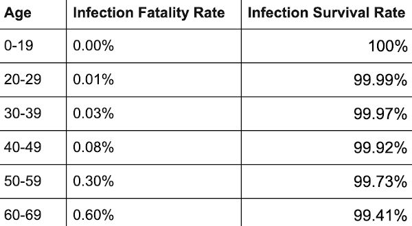
What is far more important is to know the infection fatality rate (IFR)? That is, what percentage of those infected with SARS-CoV2 will die? This, I am afraid, we are never going to know, as the definition of what the word ‘infected’ means has flipped this way and that and can never be pinned down.
Does it mean a positive test? Does it mean a positive test plus symptoms? [Which used to be called a ‘case’] Does it mean something else. What does infected actually mean…
Here, I defer to the Master – Lewis Carroll:
‘When I use a word,” Humpty Dumpty said in rather a scornful tone, “it means just what I choose it to mean — neither more nor less.”
“The question is,” said Alice, “whether you can make words mean so many different things.”
“The question is,” said Humpty Dumpty, “which is to be master – – that’s all.”
Accepting that no-one will define what COVID19 infection actually means, I believe the infection fatality rate is, (using previous used definitions) settling at around 0.15%. At least it was last time I looked. This was never enough to justify the panicked actions that have taken place around the globe. Never.
3: The figures make no sense – and never will
One of the central problems here, form which all other problems flow, is that the PCR (polymerase chain reaction) test is the test against which the PCR test itself is tested. We have nothing better. So, we are completely reliant on it being accurate. However, we cannot know how accurate it truly is, because there is no test against which to compare it.
I mentioned Koch’s postulates earlier. These are the tests which can prove if a ‘micro-organism’ is actually causing the disease. The ultimate gold standard:
The microorganism must be found in abundance in all organisms suffering from the disease, but should not be found in healthy organisms. The microorganism must be isolated from a diseased organism and grown in pure culture. The cultured microorganism should cause disease when introduced into a healthy organism. The microorganism must be re-isolated from the inoculated, diseased experimental host and identified as being identical to the original specific causative agent. And good luck with all of that. The truth is that these postulates can work for bacteria, but not really for viruses. Because it is very difficult to meet them. I am not sure if they have ever been truly met for any virus.
On the matter of finding out if the virus is truly present, in anyone diagnosed with COVID19, here is a letter that was published in the BMJ in October last year
‘We are told that the virus is everywhere – in the air, in our breath, on fomites, trapped in masks – yet public health authorities seem not to be in possession of any cultivable clinical samples of the offending pathogen.
In March 2020, the World Health Organisation instructed authorities not to look for a virus but to rely instead on a genome test, the RT-PCR, which is not specific for SARS-CoV-2 (1) (2).
A Freedom of Information request to Public Health England about cultivable clinical samples or direct evidence of viral isolation has no information and refers to the proxy RT-PCR test, quoting Eurosurveillance (3).
Eurosurveillance states: “Virus detection by reverse transcription-PCR (RT-PCR) from respiratory samples is widely used to diagnose and monitor SARS-CoV-2 infection and, increasingly, to infer infectivity of an individual. However, RT-PCR does not distinguish between infectious and non-infectious virus. Propagating virus from clinical samples confirms the presence of infectious virus but is not widely available (and) requires biosafety level 3 facilities” (4).
The CDC admits that, “no quantified virus isolates of the 2019-nCoV are currently available”, and used a genetically modified human lung alveolar adenocarcinoma cell culture to, “mimic clinical specimen”(5).
It appears, therefore, that we have public health bodies without clinical samples, a test which is non-specific and does not distinguish between infectivity and non-infectivity, a requirement for biosafety level 3 facilities to even look for a virus, yet we are led to believe that it is up all our noses.
So, where is the virus?’
(1) https://www.who.int/publications/i/item/10665-331501
(2) https://www.bmj.com/content/369/bmj.m2420/rr-5
(3) https://www.whatdotheyknow.com/request/679566/response/1625332/attach/ht…
(4) https://www.eurosurveillance.org/content/10.2807/1560-7917.ES.2020.25.32…
(5) https://www.fda.gov/media/134922/download 1
After reading this, do I still think SARS-CoV2 exists? Yes, I do. I firmly believe that I watched people dying of it, from it. They died in a way I have never seen people do so before, and I have seen a lot of people die. They seemed quite well, then suddenly their oxygen sats dropped like a stone – they still seemed okay otherwise – then they died. The end.
Very strange, and rather disturbing. I started slipping an oxygen saturation monitor onto my finger from time to time. Just in case. 99% is my average reading, if you are interested. It never dropped.
However, getting back to the testing. If you truly want to confirm the presence of a virus in a sample, you need to send it to biosafety level 3 facilities to isolate it, grow it (not really the correct word for a virus), and suchlike. This is never done in the clinical setting.
You could argue that if you wait for antibodies to develop, you can ‘prove’ that someone was infected, or not, and thus work out how accurate the PCR test has been retrospectively. Perhaps…
I speak as someone who needed seven Hepatitis B vaccinations before I produced any detectable antibodies. Did I have immunity after the first six, or not? Am I someone who simply does not make many antibodies, but still have immunity through other mechanisms? Do others simply not produce antibodies, or their level drops so fast, that they effectively disappear?
Yes, serological testing (looking for antibodies), has its own very significant problems.
‘Serological tests for SARS-CoV-2 have accuracy issues that warrant attention. They measure specific antibody responses which may take some weeks to develop after disease onset reducing the sensitivity of the assay. If blood samples were collected during the early stage of the infection, they may produce false negative results. They do not directly detect the presence of the virus. Further, antibodies may be present when SARS-CoV-2 is no longer present giving false positive case diagnosis.’ 2
In reality, we are relying on a PCR test to diagnose SARS-CoV2 infection, the accuracy of which is entirely dependent on believing that the test is accurate. Yes, that is the route to madness.
At present, in the UK, we are doing about one million tests a day 3.
We are getting about thirty thousand ‘positive’ results. Or, about 3% positive. How many of these are truly positive? Well, you can take a wild guess on that one. At one point, the CDC stated that 30% of the PCR tests were false positives. A ‘false positive’ means that test says you have the disease, when you do not. [A false negative informs you that you do not have the disease, when you do] 4.
The thirty per cent cannot be the case currently, because that would mean if you did one million tests, you would get more than three hundred thousand false positives. Instead we are getting thirty thousand, which means that it is impossible for the false positive rate to be higher than three per cent.
So, what is the true rate? Well, if is three percent, then virtually every single positive test is a false positive test. [Three per cent of one million is thirty thousand] Which would mean that no-one in the UK currently has COVID19, and everything we are doing is completely pointless. It also means that people admitted to hospital with COVID19 do not have the disease, they are suffering from, and dying from, something else with a false positive COVID19 false test stamped on their forehead.
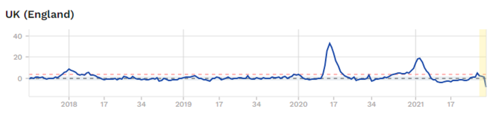
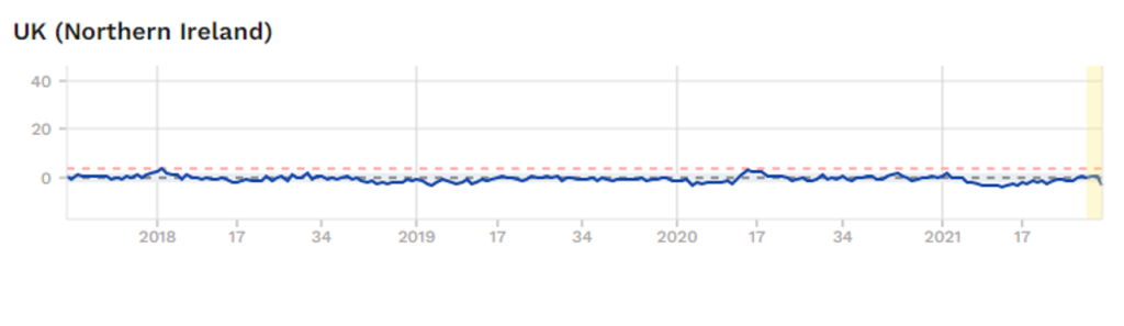
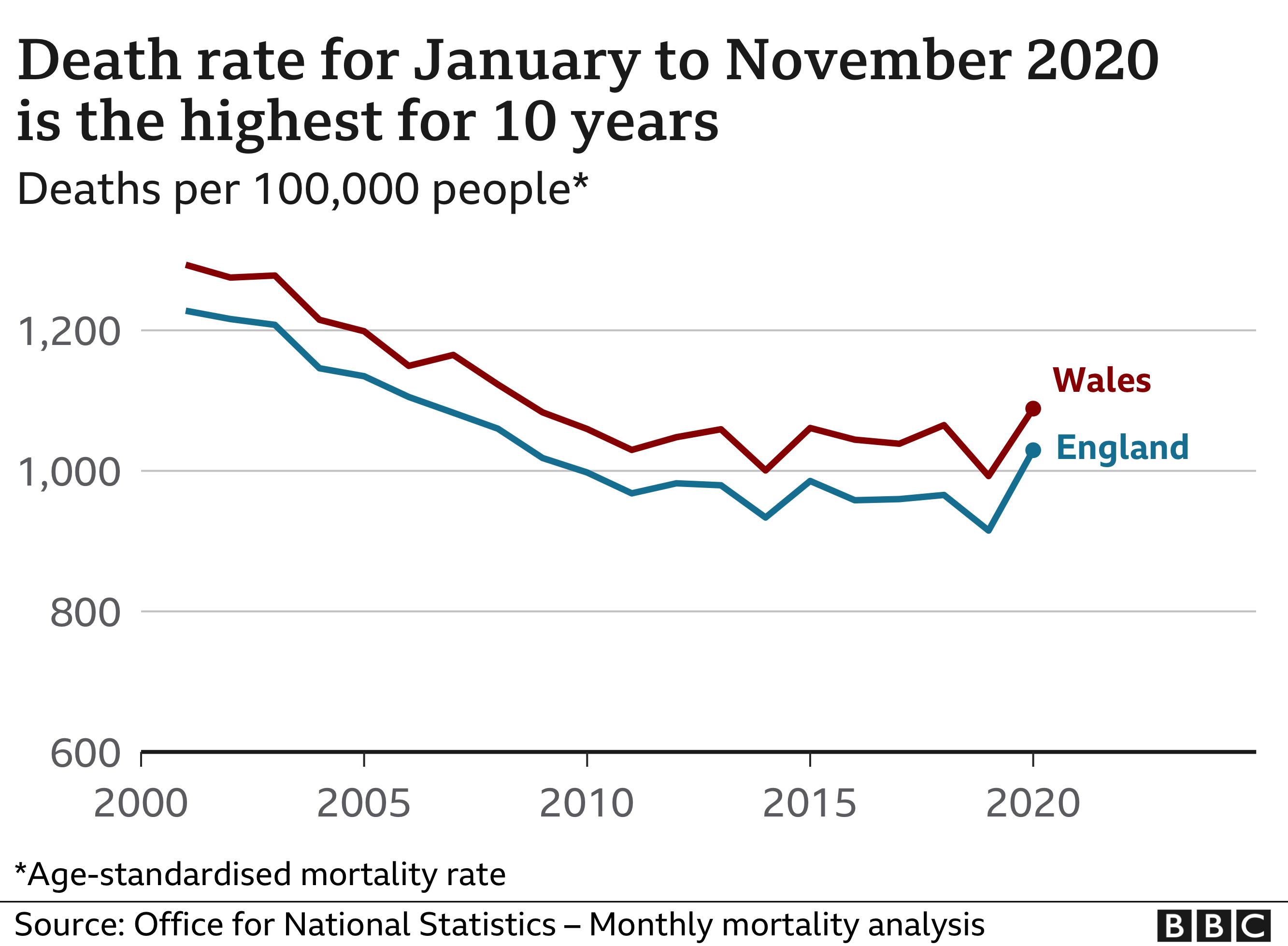
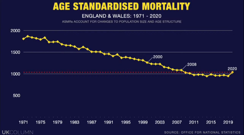
Is it possible that no-one actually is infected with SARS-CoV2? Well, it is certainly not impossible. Here is a graph of overall mortality (risk of dying of anything) from England. These figures, unlike most others, are pretty much fully reliable. Someone is either dead, or they are not. It is a difficult thing to get wrong, or manipulate. There can be some delay in registering a death, but this is not normally a major issue.