Charts
Browse the articles related to this topic below.
Join our community on Guilded.
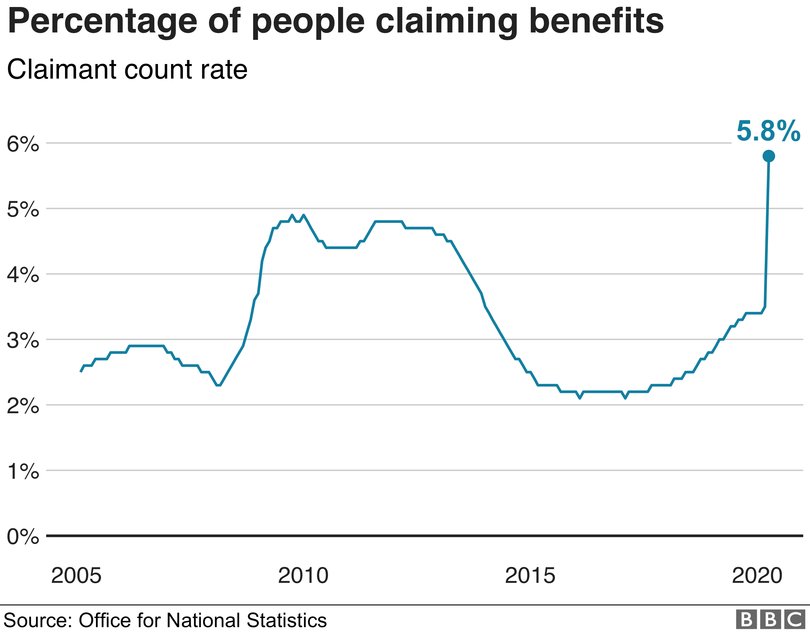
The number of people claiming unemployment benefit in the UK soared to 2.1 million in April, the first full month of the coronavirus lockdown.
But the labour market is set to worsen, according to politicians and analysts, with Therese Coffey, Secretary of State for Work and Pensions, telling the BBC on Tuesday that the unemployment rate was likely “to increase significantly”.
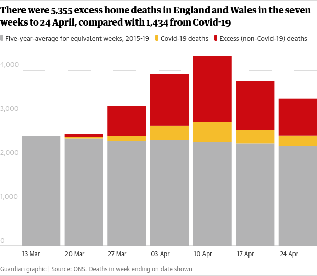
About 8,000 more people have died in their own homes since the start of the coronavirus pandemic than in normal times, a Guardian analysis has found, as concerns grow over the number avoiding going to hospital.
Of that total, 80% died of conditions unrelated to Covid-19, according to their death certificates. Doctors’ leaders have warned that fears and deprioritisation of non-coronavirus patients are taking a deadly toll.
“There are really only two particularly unusual things about the Covid-19 epidemic: the timing of its arrival and the lockdown some countries declared.”
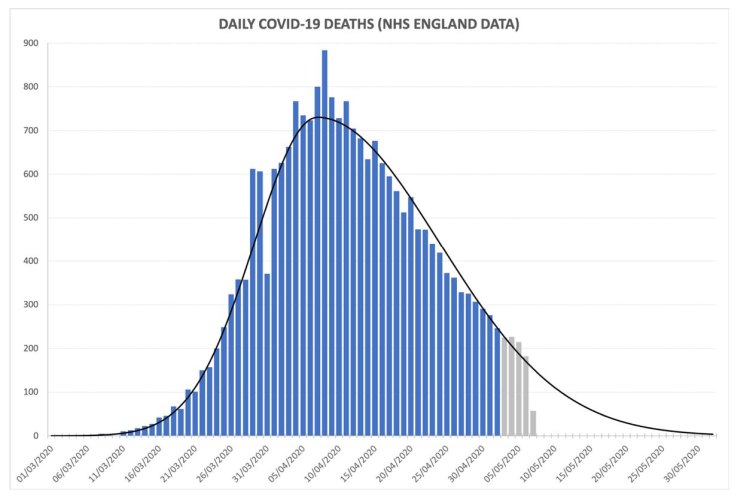
Deaths per day, as is well-reported, peaked around Easter; and because deaths lag infections by something around three weeks, this implies that infections peaked sometime in mid-March. If you add up all the bars in the chart and fill in the blank area of deaths still to come, we are looking at a killer that, in scale, is bad-but-nothing-special compared to killers of previous years. Panning out: as a killer worldwide, it looks as though Covid is going to take a toll perhaps 1% of 1918’s Spanish Flu.
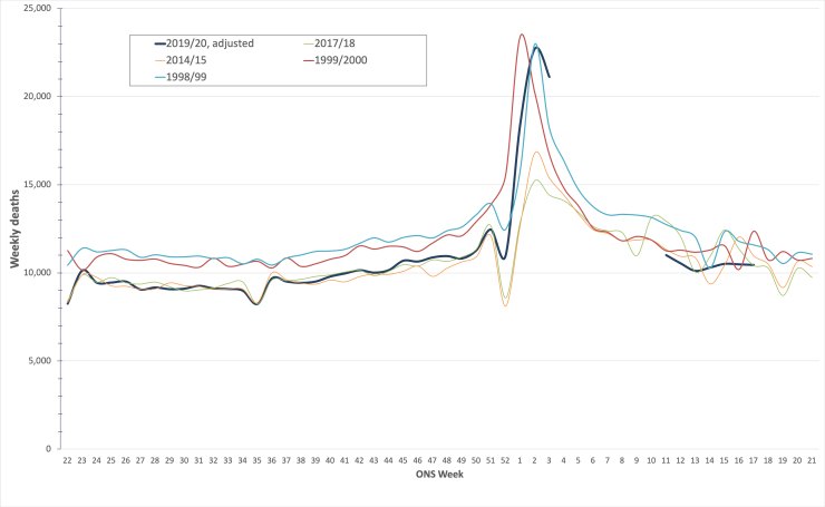
…the dark blue line is 2019-20, with Covid-19; the turquoise and red lines are the bad flu years of 1998-99 and 1999-2000.
…Covid-19 is narrowly in third place as a killer to remember, behind the 1998-99 and 1999-2000 influenzas (2017-18’s ‘Beast from the East’, the green line, doesn’t place), a point also made by American statistician William Briggs.
The spread of COVID-19 is not going to follow an exponential curve – and grave errors will follow if analysts believe it will. The number of new cases rises rapidly, peaks, and then declines. It’s called the epidemiological curve. It’s not a theory or hypothesis; it plays out that way every flu season. It is how it has played out in China and Korea for COVID-19. Flattening the peak to avoid overloading the healthcare system is the main medical goal of the seemingly extreme containment policies we have seen to date.
https://voxeu.org/article/it-s-not-exponential-economist-s-view-epidemiological-curve
Tony Heller compares COVID-19 with other pandemics and explains why the lockdown may create an even more devastating second wave.
Medical professionals say there never was a surge, hospital activity is at a low and we’re in danger of losing our capacity to deal with the second wave because we panicked.
Felix Scholkmann is a biophysicist at University Hospital Zurich, University of Zurich, Switzerland.
Categories
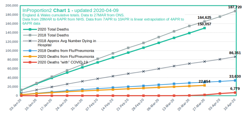
The crisis was over before lock-down
Andrew Mather, a mathematician and financier based in the UK, explains how the official data clearly showed that the COVID-19 crisis was over in the UK before the lock-down.

Visit source website at http://inproportion2.talkigy.com/