Charts
Browse the articles related to this topic below.
Join our community on Guilded.
Generally speaking, 40% to 50% of patients with severe respiratory distress die while on ventilators, experts say. But 80% or more of coronavirus patients placed on the machines in New York City have died, state and city officials say.
https://web.archive.org/web/20200409192719/https://time.com/5818547/ventilators-coronavirus/
Andrew Mather, a mathematician and financier based in the UK, offers a series of videos analysing the COVID-19 data released by various governmental and health bodies.
In this video, he presents how the government had access to data that the case-count growth rate was decelerating long before the UK lockdown.
Curve Analysis
His Primer on Curve Analysis may also be useful.
Why the UK lockdown hasn’t worked
Categories
SARS-CoV-2: fear versus data
“The mortality rate for SARS-CoV-2 is not significantly different from that for common coronaviruses identified at the study hospital in France”.
https://www.sciencedirect.com/science/article/pii/S0924857920300972

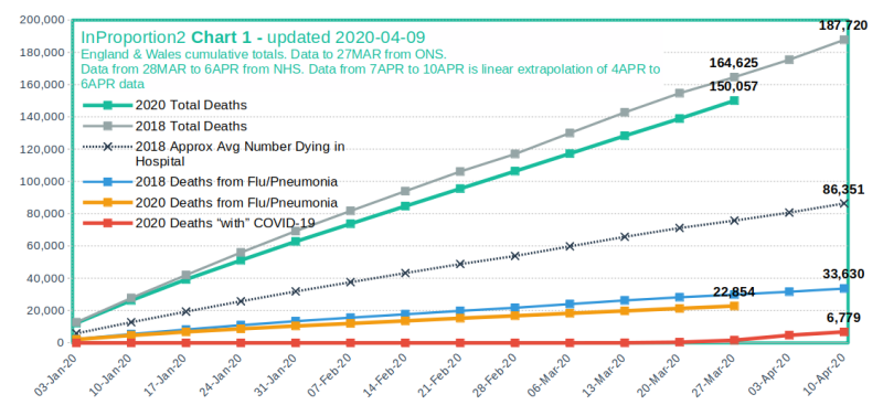
Visit source website at http://inproportion2.talkigy.com/
Nate Silver, an American statistician, tells us why coronavirus case counts are meaningless.
*Unless you know something about testing. And even then, it gets complicated.
“The numbers are almost meaningless,” says Steve Goodman, a professor of epidemiology at Stanford University. There’s a huge reservoir of people who have mild cases, and would not likely seek testing, he says. The rate of increase in positive results reflect a mixed-up combination of increased testing rates and spread of the virus.
https://finance.yahoo.com/news/confirmed-coronavirus-cases-almost-meaningless-123550415.html
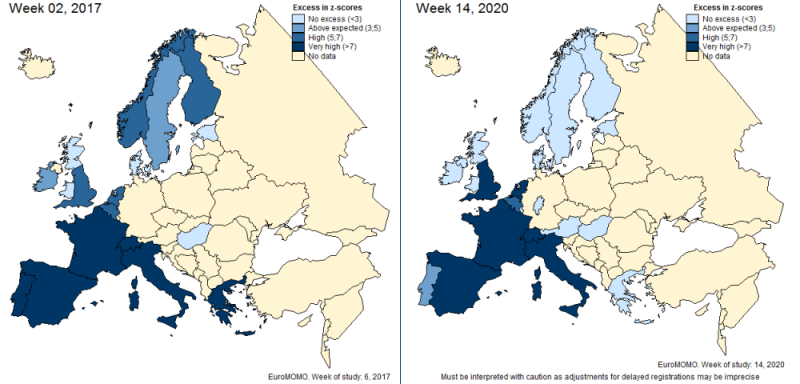
EuroMOMO is an agency that monitors deaths across Europe. The chart below compares death levels in week 2 of 2017 with week 14 of 2020. The darker blue means more deaths.