Laura Dodsworth interviews Alistair Haimes on Freethinking with Laura Dodsworth.
Support Laura Dodsworth through Patreon:
https://www.patreon.com/lauradodsworth
Interview notes and charts
- The difference between what the government was telling us and what their information was telling us was so extreme and outrageous.
- Exponential means a “constant rate of growth.” The government data in March was clearly showing that the COVID-19 was declining, not growing exponentially. This was the same in all countries you could see the data. [See chart 1]
- A constantly declining growth rate will make a bell curve. The government were standing in front of bell curve graphs during their briefings yet they were telling us we were in the middle of the epidemic.
- It was very clear that we were heading to a peak sometime around early to mid-April.
- You don’t have to be complicated mathematics to see that COVID-19 was running out of steam almost from day one.
- The conclusion from the Centre for Evidence-Based Medicine seems to be that it’s impossible to predict if there will be a second wave.
- Sweden’s epidemic looks identical to the UK’s but they did not lockdown. Their datapoint indicates there won’t be a second wave. There has been no spike in Denmark either. [See chart 2]
- Unknowns: has summer affected COVID-19 and will there be a mutation?
- Will illnesses during the autumn and winter be mis-attributed to COVID-19? Poor media coverage means that we can’t be sure.
- Symptoms of COVID-19 are very similar to the flu. Something could look like a second wave but will we really know?
- The lockdown is costing a Brexit bill a week.
- The government response seems to have been skewed by Neil Ferguson’s modelling data. The make-up of government advisors seems to be a recipe for groupthink, which is very dangerous.
- Epidemiology (the way a disease spreads through the population) is not complicated science. The government could have had lots of people who were very good at this but they didn’t.
- We should have cocooned the vulnerable, make sure the NHS has capacity and “let it rip” through the population.
- We should never have had an open-ended lockdown.
- The ‘R number’ is just the difference of in the number of people infected after each generation of a disease. Britain crossed the ‘magical R of 1’ line a few days before lockdown and the same day as Sweden. Whatever interventions have been done doesn’t seem to have had any effect. [See chart 3]
- COVID-19 is mostly a care home and hospital disease. This was obvious very early on. Old people should not have been moved from hospitals into care homes. It seems as if we knowingly seeded the most vulnerable environment with the disease.
- 37% of our deaths are care home residents but they are only 0.5% of our population. Of them are dementia sufferers.
- Over 20% of the infections were picked up in the hospitals. COVID-19 seems more like MRSA than influenza in that it’s an infection control problem.
- COVID-19 is much more comparable to flu for the rest of the population.
- 1968 flu killed 80,000 people in the UK.
- This last winter was a low flu winter. It’s quite possible that the people who died of COVID-19 are those who didn’t die.
- If you overlay COVID-19 deaths with the 2000 flu season, they look very similar. [See chart 4]
- 95% of deaths have had another serious disease. Most people have almost no chance of dying from COVID-19.
- If you are under 40, you have more chance of being struck by lightning that dying of COVID-19.
- If you are under 60, you have more chance of drowning.
- At any age, you have more chance of dying on the roads than dying of COVID-19.
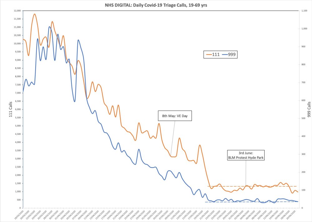
- Lead indicators of 111 and 999 calls with COVID-19 symptoms show there was no spike after VE Day celebrations or BLM protests. In fact, it was even coming down at lockdown. That lockdown was big change for COVID-19 is invisible in the data. [See chart 5]
Charts
Chart 1: COVID-19 was declining in Europe as of march. It was not growing exponentially
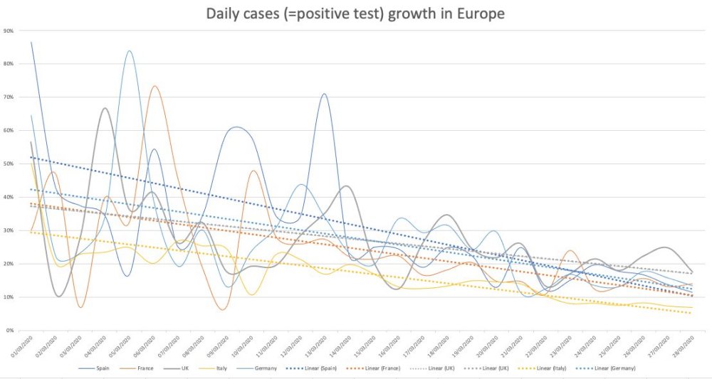
Chart 2: Sweden’s epidemic looks similar to the UK’s but they did not lock down.
Chart 3: Britain crossed the ‘magical R of 1’ line a few days before lockdown

Chart 4: COVID-19 deaths overlayed with the 2000 flu season
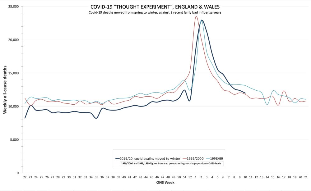
Chart 5: No spike after BLM protests